All credit for this text goes to...
Ragan, C. T. S. (2024). Macroeconomics (18th Canadian ed.). Pearson Canada.
Distinguish between positive and normative statements.
What are positive and normative statements?
Normative statements are value judgements and cannot be judged only with facts
- good vs bad
- right and wrong
- should or shouldn’t
Positive statements are fact based statements without a value judgement and can be judged with facts
- did or didn’t
“The government ought to try harder to reduce unemployment” This is a normative statement.
“If the government wants to reduce unemployment, reducing employment insurance benefits is an effective way of doing so.” This is positive advice.
Distinguishing what is actually true from what we would like to be true requires distinguishing between positive and normative statements.
It is the responsibility of the economist to state clearly what of their advice is normative and what part is positive.
How do economists use theories (models) to help understand the economy?
Why do economists use theories? How do these theories help them?
Many things are changing at the same time, and it is usually difficult to distinguish cause from effect. By examining data carefully, however, regularities and trends can be detected.
Theories are used to both explain events that have already happened and to help predict events that might happen in the future.
Theories are not always perfect; they make assumptions
Economics lacks the controlled experiments central to such sciences as physics and chemistry
How are theories formed?
Theories are abstractions
Theories are formed using variables, assumptions, and predictions
What are variables?
A well-defined item, such as a price or a quantity, that can take on different possible values.
The variables that interest economists—such as the level of employment, the price of a laptop, and the output of automobiles—are generally influenced by many forces that vary simultaneously.
Ceteris Paribus
with other conditions remaining the same
In a theory of the egg market, the variable quantity of eggs might be defined as the number of cartons of 12 “Grade A” large eggs purchased by consumers. The variable price of eggs is the amount of money that must be given up to purchase each carton of eggs. The particular values taken by those two variables might be 20,000 cartons per week at a price of $4.00 in July 2023, 18,000 cartons per week at a price of $4.25 in July 2024, and 19,500 cartons per week at a price of $4.50 in July 2025.
There are two broad categories of variables that are important in any theory.
- An endogenous variable is one whose value is determined within the theory.
- An exogenous variable influences the endogenous variables but is itself determined outside the theory.
Read more about the difference between Endogenous and Exogenous Variables in this note. To illustrate the difference, the price of eggs and the quantity of eggs are endogenous variables in our theory of the egg market—our theory is designed to explain them. The state of the weather, however, is an exogenous variable. It may well affect the number of eggs consumers demand or producers supply, but we can safely assume that the state of the weather is not influenced by the market for eggs.
What are assumptions?
What must be true for this theory to work?
A theory’s assumptions concern motives, directions of causation, and the conditions under which the theory is meant to apply.
Example
The Law of Demand
Theory: When the price of a good rises, the quantity demanded falls.
Assumption Type The Assumption What It’s Claiming Motive Consumers want to maximize satisfaction given limited income People are rational, self-interested, budget-constrained Direction of causation Price → Quantity demanded (not the reverse) Price changes cause consumers to adjust buying, not the other way around (in this instance) Conditions Other factors held constant (income, preferences, prices of other goods) Theory applies only when we isolate the price-quantity relationship Why this matters:
If any assumption is wrong, the prediction may fail:
If this assumption fails… Then… People aren’t rational maximizers They might buy more at higher prices (status goods, panic buying) Causation runs backward Maybe high demand causes high prices, not vice versa Other factors aren’t constant Income rose at the same time as price—you can’t isolate the effect For more context, read Why does causation depend on context
The phrase to remember: “Ceteris paribus” (all else equal). Most economic theories only claim to work when other factors are held constant. That’s the “conditions” assumption built into almost every model.
What are motives?
What drives the actors?
Individuals → Utility
Producers → Profit
The fundamental assumption that everyone pursues their own self-interest when making economic decisions.
- Individual consumers are assumed to strive to maximize their utility
- Producers are assumed to try to maximize their profits
What is the direction of causation?
Which variable is doing the pushing?
When economists assume that one variable is related to another, they are usually assuming some causal link between the two.
When the amount of wheat that producers want to supply is assumed to increase when the weather improves, the causation runs from the weather to the supply of wheat — they are not assumed to experience better weather as a result of their increased supply of wheat.
The Wheat Example
Why it’s listed as an assumption: The theory doesn’t prove causation runs one way—it assumes it. If the assumption is wrong, the theory’s predictions will fail.
Statement Causal Arrow Meaning Better weather → More wheat supplied Weather pushes wheat Weather is the cause, wheat supply is the effect More wheat supplied → Better weather Wheat pushes weather Nonsense—planting more wheat doesn’t change the sky The theory assumes the first arrow. That assumption is so obvious here that it feels trivial—but the assumption is still doing work.
Where direction matters more:
Observed correlation Possible direction 1 Possible direction 2 Education and income move together Education → Income (skills raise wages) Income → Education (rich families buy more school) Advertising and sales move together Advertising → Sales (ads persuade buyers) Sales → Advertising (profitable firms spend more on ads) Police presence and crime move together Police → Crime (cops deter crime) Crime → Police (high-crime areas get more cops) In each case, the theory must pick a direction. That’s an assumption. The data alone (correlation) can’t tell you which arrow is real.
What are conditions of application?
When does this apply?
Assumptions are often used to specify the conditions under which a theory is meant to hold.
Example
Supply and Demand with “No Government”
The basic supply and demand model assumes no government intervention.
This doesn’t mean: “Imagine Canada has no government.”
It means: “This theory predicts how price and quantity behave when government isn’t interfering in this particular market.”
How this plays out:
Situation Does the basic theory apply? Price of used furniture on Facebook Marketplace Yes—government isn’t setting prices or restricting sales Price of rent in Vancouver Less well—rent control policies distort the market Price of milk in Canada No—supply management system sets prices and quotas The point: When the textbook says “assume no government,” it’s telling you the boundary conditions. The theory works inside those boundaries. Outside them (rent control, supply management), you need a more complex model that accounts for government intervention.
The assumption isn’t a claim about reality—it’s a label that says “use this theory when these conditions roughly hold.”
What are predictions?
Predictions = Hypothesis
A hypothesis is a proposition that can be deduced from a theory
Most theories generate a prediction of the form “If X occurs, then Y will also happen.”
What is a Proposition
A statement that can be either true or false.
Example
Theory: When the price of a good rises, consumers will buy less of it (law of demand).
Prediction/Hypothesis: If the price of coffee increases, the quantity of coffee demanded will decrease.
The prediction is the testable, specific application—you can actually observe what happens after a price change and see if the data matches what the theory predicts.
What theories do they use?
Supply and Demand → learn more in ECON-1221 Chapter 3 - Notes from the Textbook
Understand the interaction between economic theories and empirical observation.
What is the interaction between economic theories and empirical observation?
How do economists test their theories?
A theory is tested by confronting its predictions with empirical evidence.
Economists generally lack the ability to set up controlled experiments in which one variable can be adjusted and then other variables observed. Instead, economists usually rely on data produced in the real world by the activities of consumers, firms, and governments, and then use sophisticated statistical techniques to infer the underlying causality between the variables.
Example: Randomized Control Tests
Pharmaceutical firms have long used randomized controlled trials (RCTs) to test the effectiveness of new drugs. In an RCT, two groups of people are randomly selected from the population: the “control” group and the “treatment” group. The control group is provided with a placebo while the treatment group is provided with the drug being tested. The two groups are then followed over time, and data about their response to the drug is collected and analyzed. Since the two groups were created randomly, and the only systematic difference between them is whether or not they received the drug, any significant difference in the groups’ behaviour is attributed to the drug being tested. In this way, the RCT can establish the causal effect of using the drug.
There is concern, however, that the RCT approach may be too rigid to be useful for situations where proposed policy changes are more complex.
Ricardo Hausmann, a prominent development economist at Harvard, poses the following hypothetical example. Suppose we want to know whether the use of tablet computers in schools in a low-income country leads to improvements in students’ performance, and we choose to use the RCT approach. We can select many schools, randomly assign them to control and treatment groups, issue tablets (loaded with specific software packages and apps) to the teachers in the treatment group, instruct the teachers how to use the tablets in their teaching, and then collect data on the students in both groups over the next several months.
Suppose this RCT is conducted and the analysis of the data shows no difference in students’ performance between the control and treatment groups. What should we conclude? It is tempting to conclude that tablets are not useful in classrooms for improving educational performance. Hausmann’s argument, however, is that this may be the wrong conclusion to draw. He argues that we should only conclude in this case that those specific tablets, loaded with those specific software packages, and used in those specific ways, did not have a measurable impact on students’ performance. Perhaps different tablets with different software and used with different teaching methods would have had an important impact—but the very nature of the RCT approach is that it lacks the flexibility to uncover this possibility.
Beyond the Textbook
What Hausmann is saying:
RCTs work well when the intervention is simple and fixed (drug vs. placebo). But when the intervention is complex with many moving parts (tablets + software + teaching methods + teacher training), a negative result doesn’t tell you much.
You tested one specific combination. Maybe a different combination would work.
The tension:
RCT Strength RCT Weakness Controls for confounding variables Tests only one fixed version of intervention Establishes causation cleanly Can’t explore which variant of intervention works The implied trade-off:
More rigorous RCT design = more confident causal claims about that specific intervention
But = less ability to discover what actually works when the intervention has many possible configurations
The textbook doesn’t give the answer, but here’s what the field actually does:
One RCT tests one configuration. If it fails, you learn almost nothing.
Solutions...
Approach How it works Factorial design Test multiple variants simultaneously (tablets + software A vs. tablets + software B vs. tablets + different teaching method). Same RCT, multiple treatment arms. Pilot first Small exploratory study to figure out which configuration is promising, then run the rigorous RCT on that version. Iterative RCTs Run a sequence—each RCT informs the next. First one fails → adjust → run another. Adaptive trials Start with multiple arms, drop failing ones mid-study, reallocate participants to promising arms. Don't bet everything on one configuration. Either test multiple variants at once, or build in a discovery phase before the confirmatory phase.
The trade-off doesn't go away
More variants = more participants needed = more expensive.
You’re always balancing rigor against cost and feasibility.
Tip
Get evidence using the Research Response SOP
Confront claims a theory makes using my Seven Lenses Framework
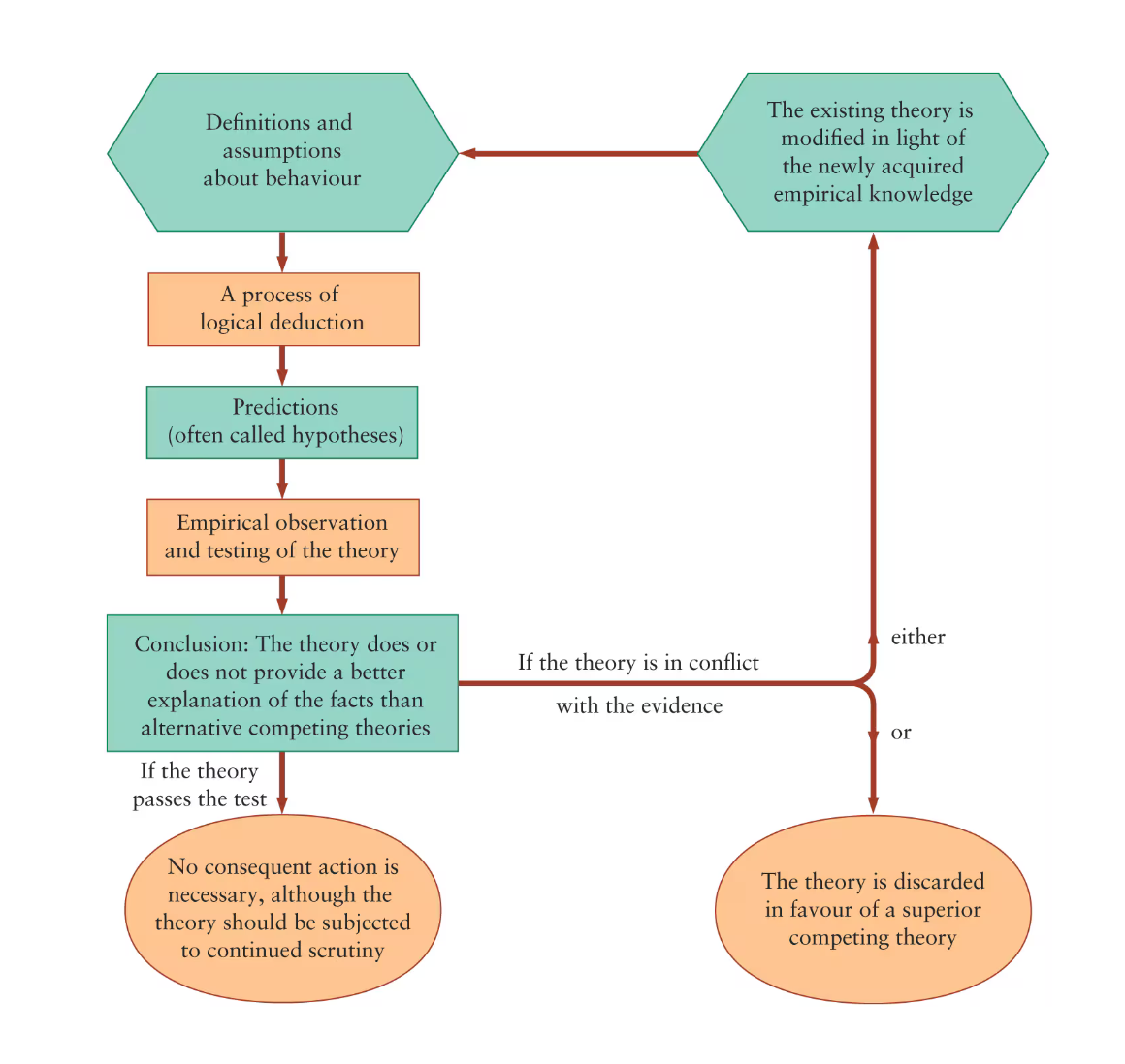
When a theory’s predictions are consistently rejected by empirical observation it is either modified or replaced.
Theories require feedback loops
This echos Scrum and Agile principles of continuous improvement
Empirical observation leads to the construction of theories, theories generate specific predictions, and the predictions are tested by more detailed empirical observation.
Correlation Versus Causation
Idea
Correlation: X and Y move together (observed pattern in data).
Causation: X actually directly makes Y change (mechanism).
Correlation (X and Y move together) doesn't tell you why they move together.
| Pattern | What’s happening | Example |
|---|---|---|
| X → Y | X causes Y | Education → Higher income |
| X ← Y | Y causes X | Higher income → Buys more education |
| Z → X and Z → Y | Third variable causes both | Rich parents → More education AND → Higher income |
The Trap
When you see correlation in data, all three patterns look identical.
The data just shows “education and income move together”—it can’t tell you which arrow is real.
The Fix
You need something beyond correlation to establish causation.
Experiments (randomize who gets education), natural experiments, or careful design that rules out the other arrows.
Example
Ice cream sales and drowning deaths are positively correlated. Does ice cream cause drowning?
No—there’s a Z: hot weather. Hot weather → more ice cream AND → more swimming → more drownings.
The correlation is real, but the causal story “ice cream → drowning” is nonsense.
Why this matters for the textbook passage: Ragan is warning you that finding “education and income are correlated” doesn’t prove “education causes income.” You’d need to rule out reverse causation (rich people buy education) and third variables (rich parents cause both).
Identify several types of economic data, including index numbers, time-series and cross-sectional data, and scatter diagrams.
What are index numbers?
An index number expresses a variable in a given year as a percentage of the base year.
Index numbers are calculated by dividing the value in the given year by the value in the base year and multiplying the result by 100
Why use index numbers?
It is easier to compare the two paths if we focus on relative rather than absolute changes.
It may be difficult to compare the time paths of the two different variables if we just look at the “raw” data. Because the two variables are measured in different units, it is not immediately clear which of the two variables is more volatile or which, if either, has an upward or a downward trend.
We start by taking the value of the variable at some point in time as the “base” with which the values in other periods will be compared. We call this the base period. In the present example, we choose 2014 as the base year for both series. We then take the output in each subsequent year, called the “given year,” divide it by the output in the base year, and then multiply the result by 100.
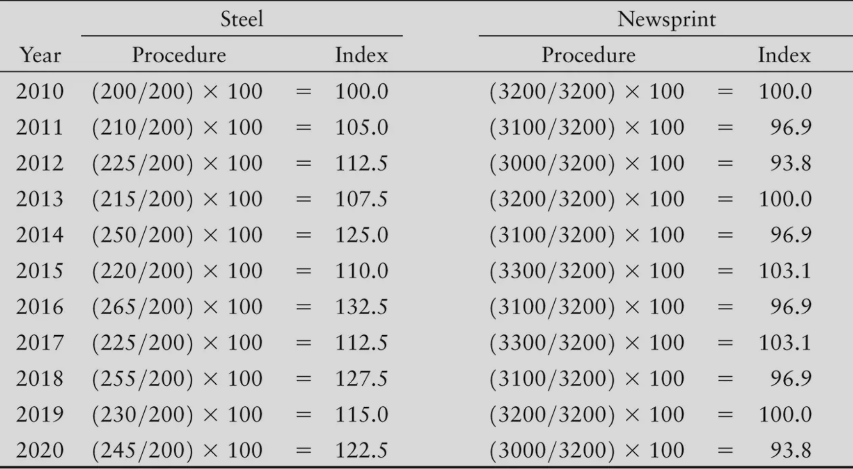
The Trap
Index numbers look like percentages, so your brain wants to subtract them directly.
Why that’s wrong: Percentage change is always relative to where you started.
Example
Base year (2010) steel output = 200 (thousands of tonnes).
Year Actual Output Index 2010 (base) 200 100.0 2014 250 125.0 2016 265 132.5 From 2014 to 2016, output went from 250 → 265.
The Question: What’s the percentage increase from 2014 to 2016?
Wrong thinking: “132.5 minus 125 = 7.5, so 7.5%”
Right thinking: “I gained 15 thousand tonnes. What percentage is that of where I started (250)?”
Or using the index numbers directly:
The Intuition: 7.5 is a smaller proportion of 125 than it would be of 100. That’s why it’s 6%, not 7.5%.
Statistical Literacy — Make sure you’re using the right base number
The Consumer Price Index (CPI) is an index number. This is a price index of the weighted average price paid by consumers for the typical collection of goods and services that they buy.
What is weighted average and how does that relate to CPI?
CPI isn’t one price—it’s thousands of prices combined. The combination uses weights based on how much of your budget each item takes.
Why not a simple average?
Item Price Change Simple Average Contribution Sardines +50% +25% Housing +2% +1% Average +26% That’s absurd. You spend maybe 20,000/year on housing. A 50% sardine spike shouldn’t dominate your cost of living.
Weighted average fixes this:
Item Price Change Budget Share (Weight) Contribution to CPI Sardines +50% 0.1% +0.05% Housing +2% 30% +0.60% Weighted CPI change +0.65% Now housing’s small change matters more than sardine’s big change—because housing is where your money actually goes.
The formula:
Each item’s impact = its price change × its share of typical spending.
The intuition: CPI answers “how much more does it cost to live?” Weights make sure items affect that answer proportionally to how much you actually spend on them.
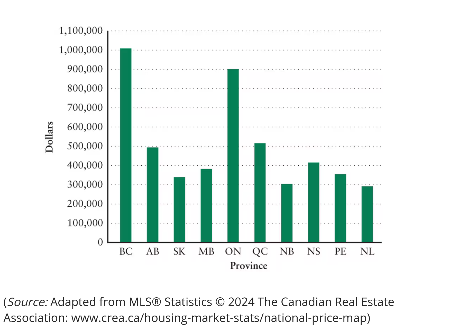
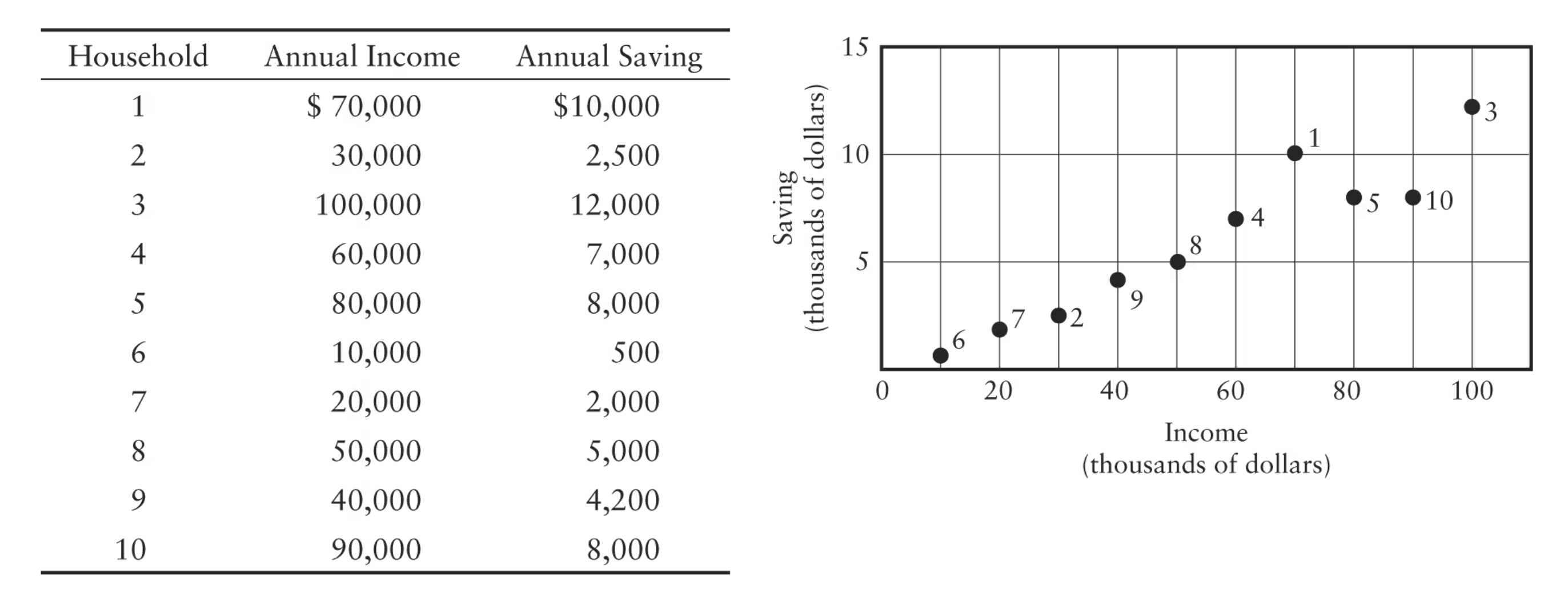
What is cross sectional data?
Different observations on one variable all taken in different places at the same point in time
Example
Histogram
Average selling price of a house in each of the 10 Canadian provinces in April 2024
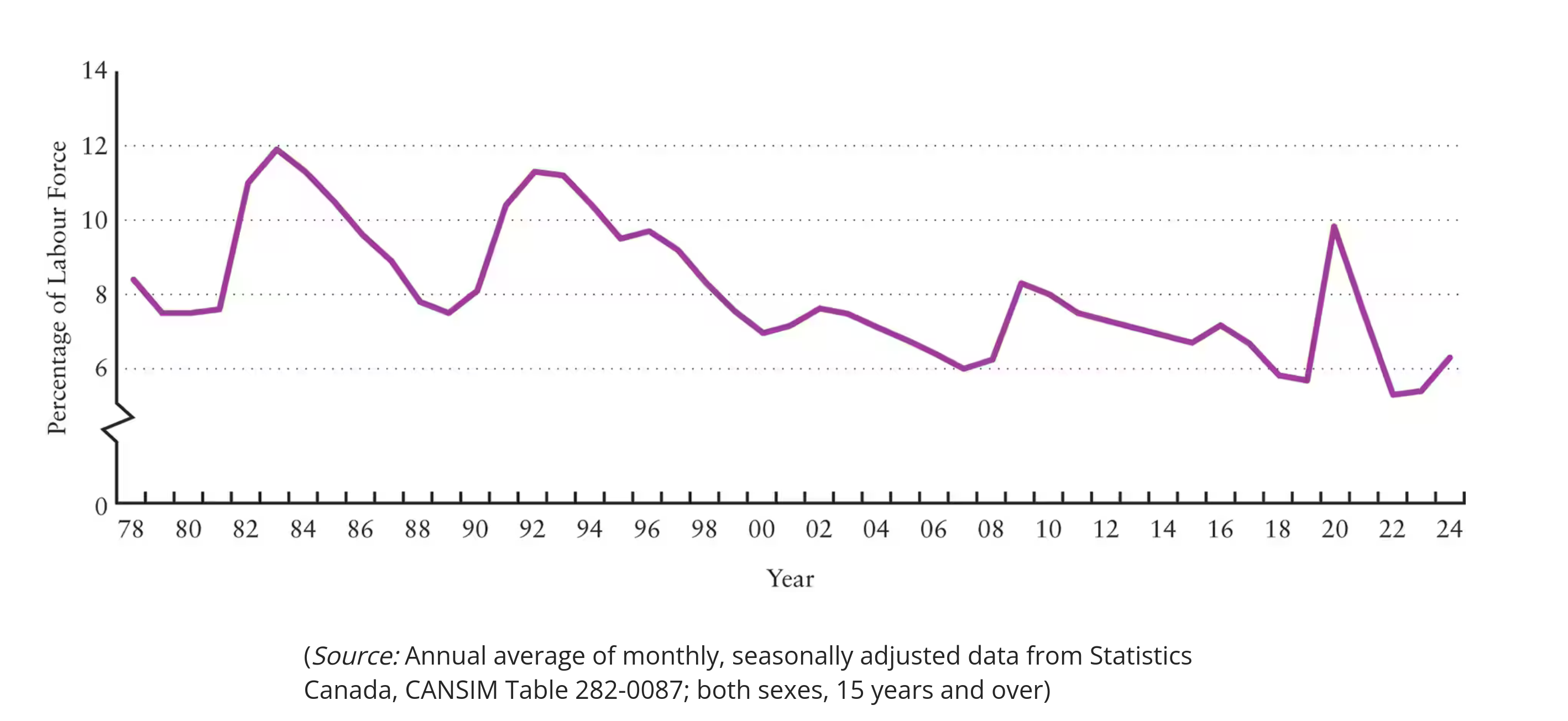
What is time series data?
Shows one variable over time (time = X-axis)
What are scatter diagrams
Shows the relationship between two different variables
Recognize the slope of a line on a graph relating two variables as the “marginal response” of one variable to a change in the other.
What is a function
A function is a rule. Give it an input (X), it gives you exactly one output (Y).
Four ways to say the same thing:
| Format | The relationship |
|---|---|
| Words | ”Spend $800 even with zero income, plus 80 cents of every dollar earned” |
| Equation | C = 800 + 0.8W |
| Table | W=0→C=800, W=1000→C=1600, W=2000→C=2400… |
| Graph | Straight line, starts at 800, slopes upward |
All four are expressing the same function. Pick whichever makes the problem easiest.
Breaking down C = 800 + 0.8W:
| Component | Meaning | Name |
|---|---|---|
| 800 | Spending when income = 0 (borrowing/savings) | Autonomous consumption |
| 0.8 | For every 0.80 | Marginal propensity to consume |
| W | Input: wage income | Independent variable |
| C | Output: consumption | Dependent variable |
Plug in numbers to verify:
| W (income) | C = 800 + 0.8W | C (consumption) |
|---|---|---|
| $0 | 800 + 0.8(0) | $800 |
| $1,000 | 800 + 0.8(1000) | $1,600 |
| $2,000 | 800 + 0.8(2000) | $2,400 |
The Trap
Don’t confuse the function (the rule) with specific values (plugging in numbers).
The function is C = 800 + 0.8W.
The values 1,600, $2,400 are outputs for specific inputs.
Positive and negative relationships
When income goes up, consumption goes up. In such a relation the two variables are positively related to each other.
As the amount spent on pollution reduction goes up, the amount of remaining pollution goes down. In such a relation the two variables are negatively related to each other.
| Relationship | Pattern | Example |
|---|---|---|
| Positive | X↑ → Y↑ (or X↓ → Y↓) | Income↑ → Consumption↑ |
| Negative | X↑ → Y↓ (or X↓ → Y↑) | Pollution spending↑ → Pollution↓ |
| Visual shortcut: |
- Positive = graph slopes upward (↗)
- Negative = graph slopes downward (↘)
Synonym alert: You’ll also see “direct relationship” (positive) and “inverse relationship” (negative). Same thing, different words.
What is a marginal response + how does it relate to slope?
Slope is marginal response. They're the same thing measured the same way.
Linear vs. Non-Linear
| Function type | Slope behavior | Marginal response |
|---|---|---|
| Linear | Same everywhere | Constant |
| Non-linear | Changes as you move | Varies by position |
Linear: Constant Marginal Response
left=0; right=12; bottom=0; top=7;
---
y = 6 - 0.5x | label: Pollution (linear)
Slope = −0.5 everywhere. Every $1 spent reduces pollution by 0.5 tonnes, no matter where you are on the line.
Non-Linear: Diminishing Marginal Response
left=0; right=16; bottom=0; top=7;
---
y = 7/(1 + 0.3x) | label: Pollution (non-linear)
Curve flattens as you move right. Early spending has steep slope (big payoff). Later spending has shallow slope (small payoff).
| Move | Spending | Pollution Reduced | Cost per Tonne |
|---|---|---|---|
| A → B | $1,000 | 1,000 tonnes | $1 |
| C → D | $6,000 | 1,000 tonnes | $6 |
How to measure slope at a given point on a curve?
Draw a tangent line (touches curve at only that point). The tangent’s slope = the curve’s slope at that point.
Non-Linear: Increasing Marginal Response
left=0; right=60; bottom=0; top=550;
---
y = 120 + 0.15x^2 | label: Production Cost
Curve steepens as you move right. Approaching capacity makes each additional unit more expensive.
| Move | Extra Output | Extra Cost | Cost per Stick |
|---|---|---|---|
| A → B | 10,000 sticks | $30,000 | $3 |
| C → D | 10,000 sticks | $150,000 | $15 |
Functions with Maximum: Slope Crosses Zero
left=0; right=5000; bottom=0; top=500;
---
y = -0.00005(x - 2500)^2 + 400 | label: Profit| Region | Slope | Meaning |
|---|---|---|
| Left of peak | Positive | More output → more profit |
| At peak (A) | Zero | Profit maximized |
| Right of peak | Negative | More output → less profit |
The rule: At a maximum, the tangent line is horizontal. Slope = 0. Marginal response = 0.
Functions with Minimum: Slope Crosses Zero
left=0; right=180; bottom=0; top=15;
---
y = 0.001(x - 95)^2 + 6 | label: Fuel Consumption| Region | Slope | Meaning |
|---|---|---|
| Left of bottom | Negative | Faster → less fuel per km |
| At bottom (A) | Zero | Optimal efficiency (95 km/h) |
| Right of bottom | Positive | Faster → more fuel per km |
The rule: At a minimum, the tangent line is horizontal. Slope = 0. Marginal response = 0.
Summary
| Slope | Marginal Response | What’s Happening |
|---|---|---|
| Positive | Positive | X↑ → Y↑ |
| Negative | Negative | X↑ → Y↓ |
| Zero | Zero | At max or min—no change in Y |
| Decreasing | Diminishing | Payoff shrinking |
| Increasing | Increasing | Cost growing |
At either a minimum or a maximum of a function, the slope of the curve is zero. Therefore, at the minimum or maximum the marginal response of Y to a change in X is zero.